 |
|---|
Image credit to Chern
Scribblenauts Fightin' Words
iOS 2D Mobile Game UI design
Role: UI Artist
Company: 5thcell Media LLC
Responsibilities: Conceptualize, create, and integrate 2D/3D assets into games.
Assist in the design of UI flow and function.
Communicate designs in a technical manner for programmer implementation.
Mentors: Tommy Mabe, Haydn Dalton.
Tools Used: Photoshop, Illustrator, Flash.
Date: September. 2015- March. 2016

Game Overview
"Project Green is an RPG Word Puzzle Game, with the visual feedback of classic Arcade games. Our goal is to produce a simple game, which is incredibly well executed, with the primary goal of continually stimulating the player with positive feedback.
Maxwell/Lilly are recalling back to the start of some Amazing Adventures they’ve had with the Magic Notebook; They’ve time travelled, fought monsters, stopped alien invasions, stormed castles and everything else in-between. The FTE of the game will work as part of our storytelling mechanism and a way to teach users to play the game."
----Haydn Dalton, Principal Designer in 5thcell Media
User Interface Design & Redesign
Analysis of original UI design

Information Arrangement

- Importance +
Color Palette

Visual Language


Info Panel

Font Used
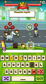
Example of original user interface
Refinement & Redesign

One of the design iterations

Final version
For the previous UIs, the color feels a little bit dark which is giving a sense of negative. So I decided to use a brighter color palette which has more contrast in hue and saturation.
As for the layout, I made the info panel more obvious when first come to this screen, and chunk info together into three main groups.
A vivid character is more attractive than a static icon. And also simplified the icons to make the overall screen looks cleaner and easier to learn/use.
Other UIs


Navigation Redesign

Original Navigation Design

New Navigation Design ---- Unselected Status

New Navigation Design ---- Selected Status
Highlighted Design Porcess


Icon Design


Typeface

Sketches


Each time before I start to make something with computer, I always start with pen and paper first. It is more flexible for me, and I can generate ideas as much as possible and quickly sketch them out on a piece of paper.
These sketches demonstrated how the high fidelity UIs come from. For most UIs I made, they always born on the paper first, and then, grew up on a computer.
Learning and Reflections
This the first real project that I've been working on, and I feel very proud of it although it haven't published globally at the end. Game UI is not that simply like what I supposed at beginning. As a player, it's hard to understand how these UIs have been created, iterated, redesigned time by time, even some of them only shown about 0.1 second in the game.
Design is about iteration. There're thousands of possibilities about how do you want to present the game, what kind of feeling you want to convey to players, what context should be in, and also, what's the goal for players to keep them playing the game. I've spent most of my time exploring, instead of doing. For my understanding, drawing a beautiful icon could be a great skill, but the more important thing is understanding player's expectations, and give them higher satisfaction even than they expected.
During the 6 month spending in game UI art, I've improved my skills of creating compelling UIs, and learnt some background knowledge about F2P games. I would pursue myself to learn more while practising, and hope to make a killer-level game in future.